THERA-PAL
Who Therapy
What Mental Health
When Current
Where Brooklyn, NY
Why Self Growth
What Mental Health
When Current
Where Brooklyn, NY
Why Self Growth
Case study
People are interested in seeking therapy to improve their mental health and develop healthier habits. However, they struggle with overcoming old habits and would like to incorporate positive therapeutic practices into their everyday life.
How might we reinforce frequent and positive action to create long lasting benefits?
Scope: Two weeks - Research, concept design and prototype.
How might we reinforce frequent and positive action to create long lasting benefits?
Scope: Two weeks - Research, concept design and prototype.

Research
User interviews
3 females and 3 males - ages ranged from 23 to 34.
5 out of 6 interviewees had participated in therapy of some form.
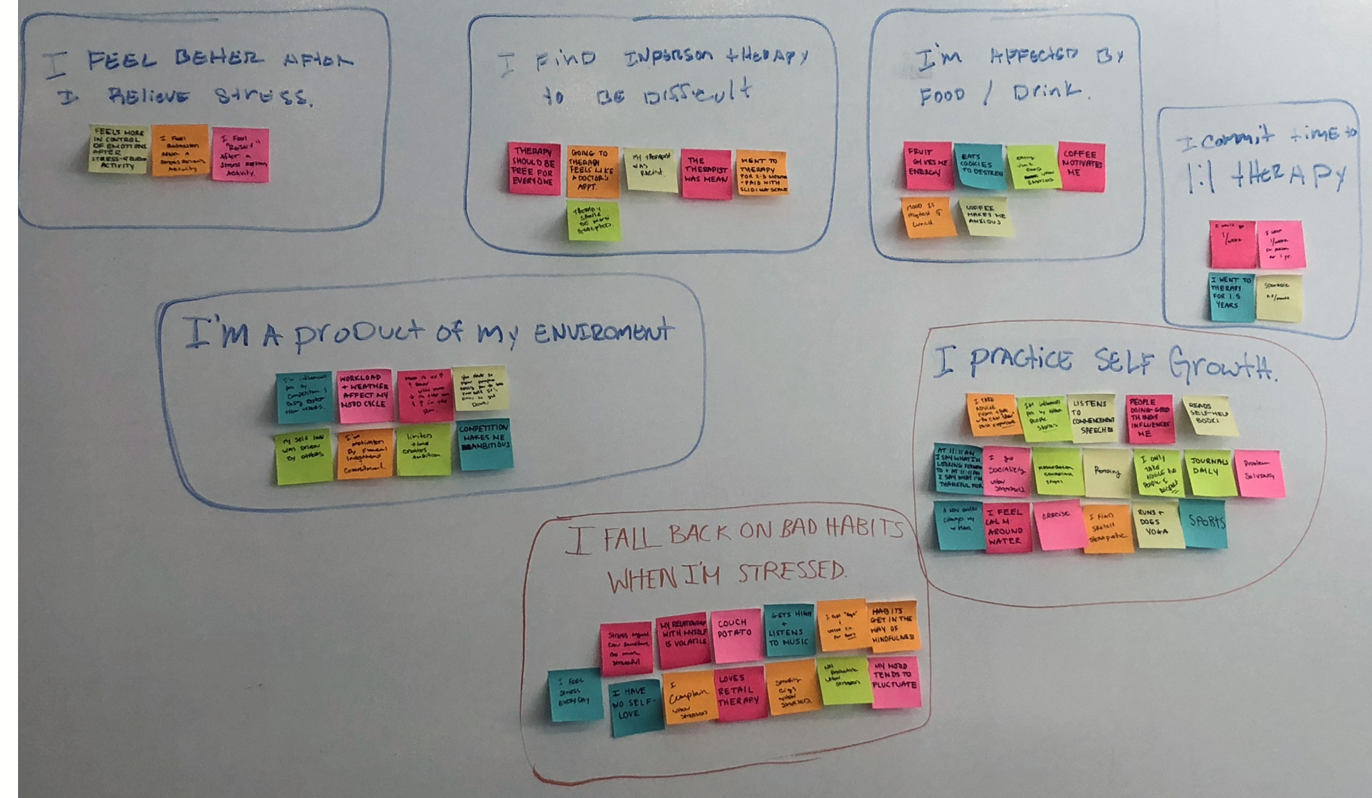
Insights
1. Users liked solving problems when stressed
2. Users wanted to monitor growth over time
3. Users liked reading and journaling when stressed
4. Users felt that therapy sessions were like “doctor’s appointments”
5. Users said their moods were up and down at various times throughout the day
Research indicated an opportunity for a supplemental app to provide therapy-seekers with additional guidance in the form of:
• daily journaling prompts
• mental exercises
• reading material
• puzzles and more
Ideation
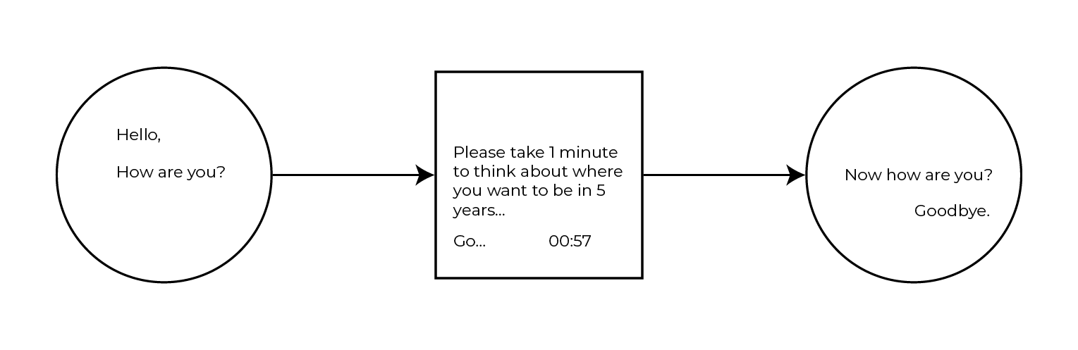
A notification system set up to your preference - reminding you throughout the day to practice positive theraputic exercises, thoughts and skills. creating new habits more efficiently.
Design + Testing
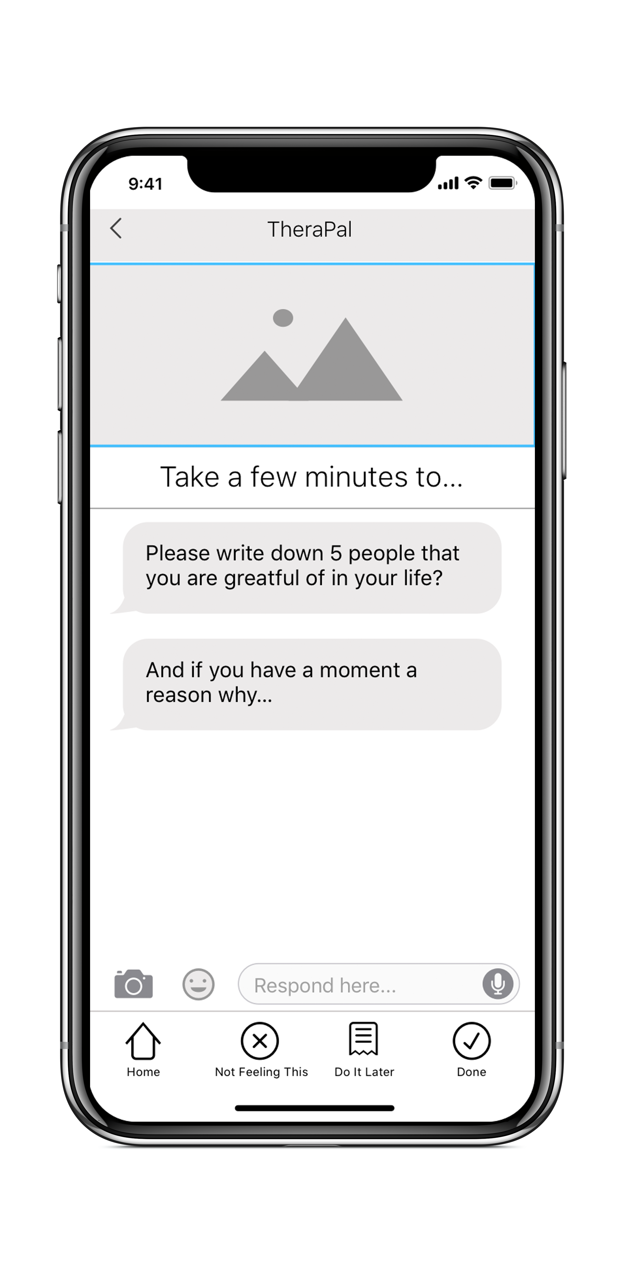
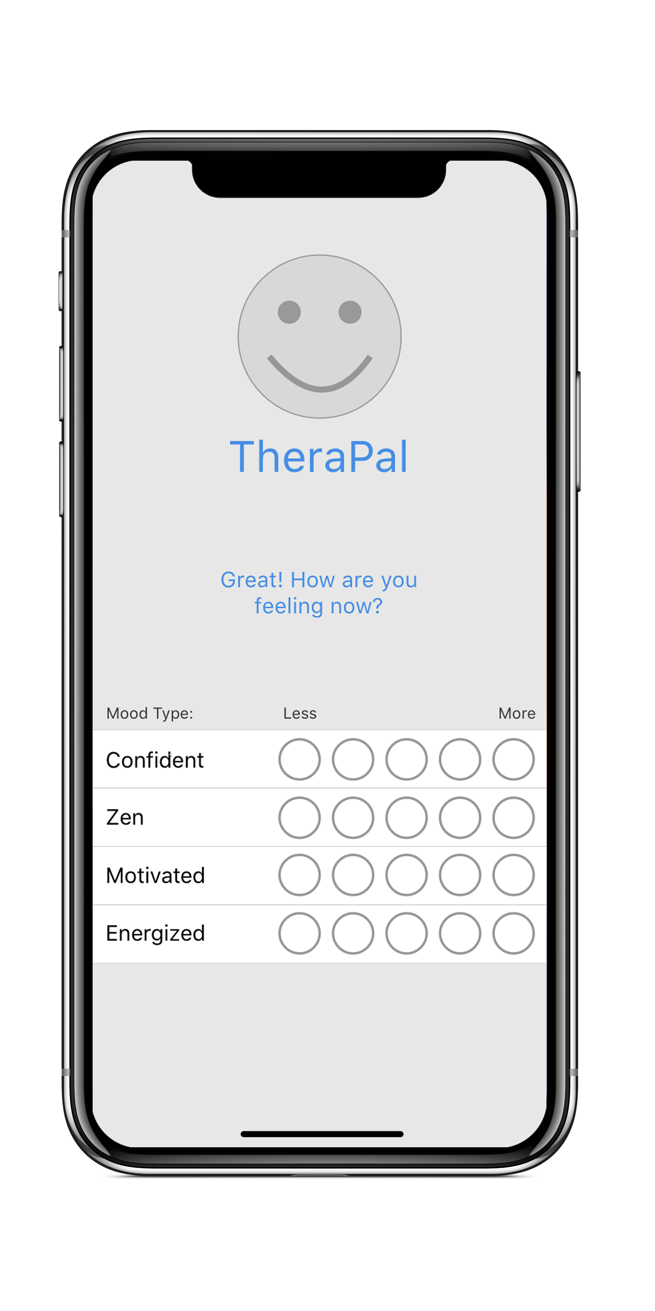
Based on research, a concept was developed to usability test.
We created a prototype for both the on-boarding/ sign-up, as well as a typical exercise prompt.
MID-FIDELITY : WIREFRAMES

Usability Testing
2 Rounds
4 users per round
Randomly selected in the Flatiron district of NYC

Findings:
2/8 users felt the choice bubbles seemed like “more work” compared to a slider.
1/8 users also identified a labelling issue with the bubbles.
Analysis:
Selecting the bubbles creates extra clicks for the user and also makes the screen look busy due to their size. We want our product to be simple to use and, ultimately, soothing to our users.
Recommendations:
Change the bubbles to a slider bar to conserve space and reduce clicks.
Findings:
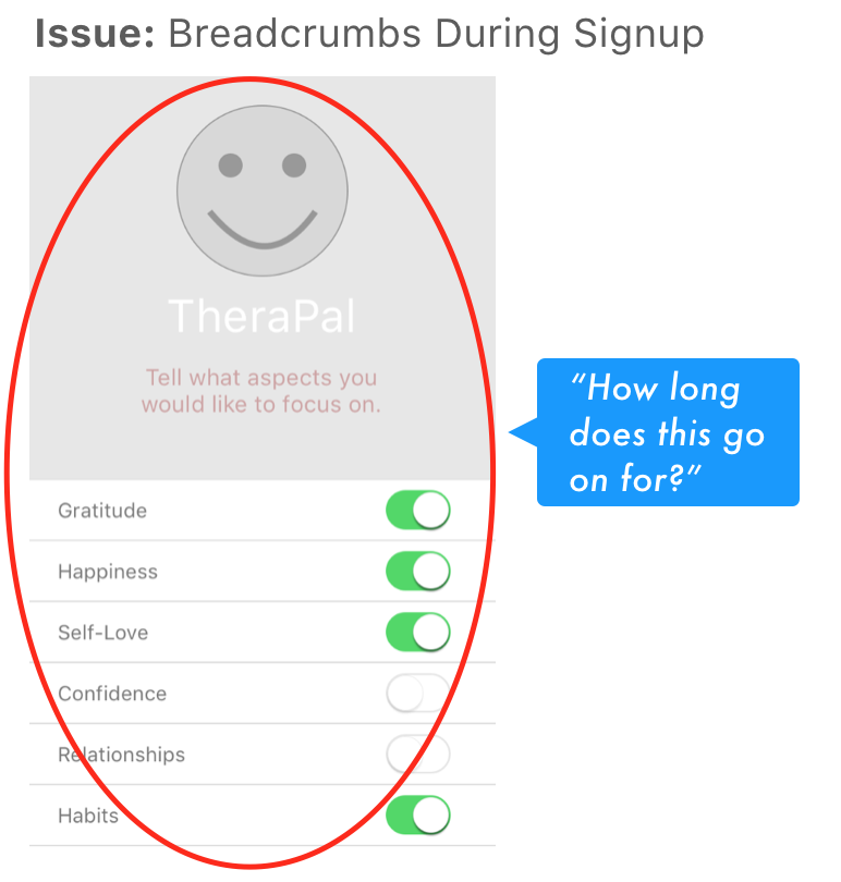
2/8 users felt that the signup process felt a little long due to a lack of breadcrumbs and/or status bar signifying where you are in the process.
Analysis:
The signup process is already quite lengthy and in depth; users are having trouble tracking their progress throughout the process.
Recommendations:
Add a status bar and page numbers to help guide the signup process.
Hi-Fi + Prototype
After several rounds of usability testing we began to find confidence in our design. We flushed out a Hi-fidelity set of wireframes to bring us into the next stage of design.
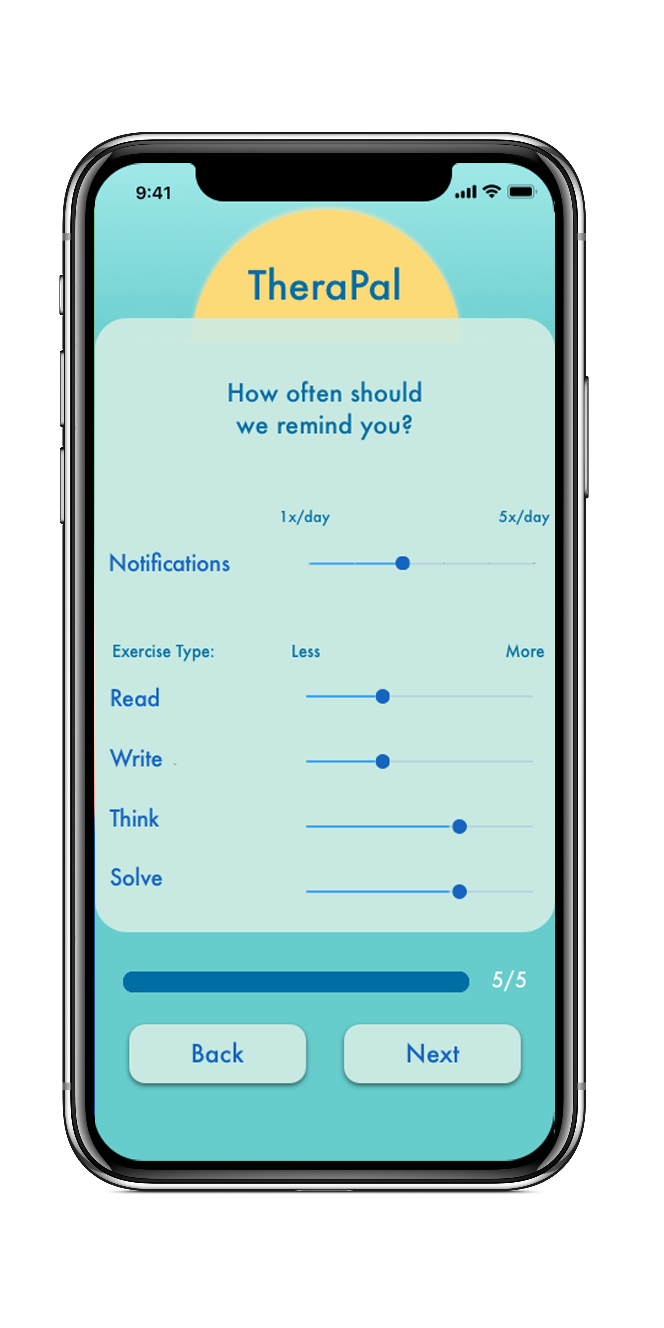
HI-FIDELITY : PROTOTYPE


CLICK FOR PROTOTYPE
Conclusion
Up to this point - all the feed back recieved was overwhelmingly positive. Through user research and testing we found and proved validity in the concept. “when will this be available” asked two of the usability test subjects.
Although the concept seems to have some validity there are many areas that could benifit from R & D in order to provide a full proof of concept.
Next Steps
1. Test our hi-fi prototype - define interaction design through color pallette, shape and copy redefinition.
2. Build out the “exercise” content for all 4 sections.
3. Explore how we can intergrate data through partnering services.
4. Redesign in order to fall within iOS standards.